Color is one of the most powerful tools in interior design, especially when it comes to making small spaces appear larger and more open. Whether you’re decorating a studio apartment, a compact bedroom, or a narrow hallway, the right color palette can visually expand your space, reflect more light, and create an airy, spacious feel — all without knocking down a single wall.
In this article, you’ll learn exactly how to choose and use colors that make rooms look bigger, plus practical tips on how to apply them in your home decor.
1. Why Color Affects Perception of Space
Colors can change how we perceive size and depth. Light, cool tones reflect more light, making a room feel larger and more open. Dark or warm colors absorb light, creating a cozy, intimate effect — which can sometimes make spaces feel smaller.
That’s why choosing a strategic color palette is essential in small rooms: it helps stretch visual boundaries and enhances natural or artificial light.
2. Go Light and Bright
Light colors are the gold standard for making rooms appear larger. They reflect light well, open up walls, and create a sense of calm spaciousness.
Best choices include:
- Soft whites – Clean and timeless
- Light gray – Modern and subtle
- Pale beige – Warm without closing in the space
- Cool pastels – Like mint, lavender, or pale pink for a touch of color
Use these shades on walls, ceilings, and large furniture to establish a spacious foundation.
3. Use a Monochromatic Color Scheme
A monochromatic scheme uses different tones of the same color, which keeps the visual flow uninterrupted — making the space feel larger and more cohesive.
For example:
- Light gray walls
- Medium gray textiles
- Darker gray accents like picture frames or lamps
This technique minimizes contrast, which can break up the space visually.
4. Consider Cool Colors for Depth
Cool colors (those with blue or green undertones) tend to recede visually, creating a sense of distance.
Try these hues:
- Pale blue – Calming and reflective
- Soft green – Brings freshness and nature indoors
- Light teal or aqua – Adds a subtle pop while still feeling open
Use cool tones on walls or larger surfaces to help create the illusion of more depth and space.
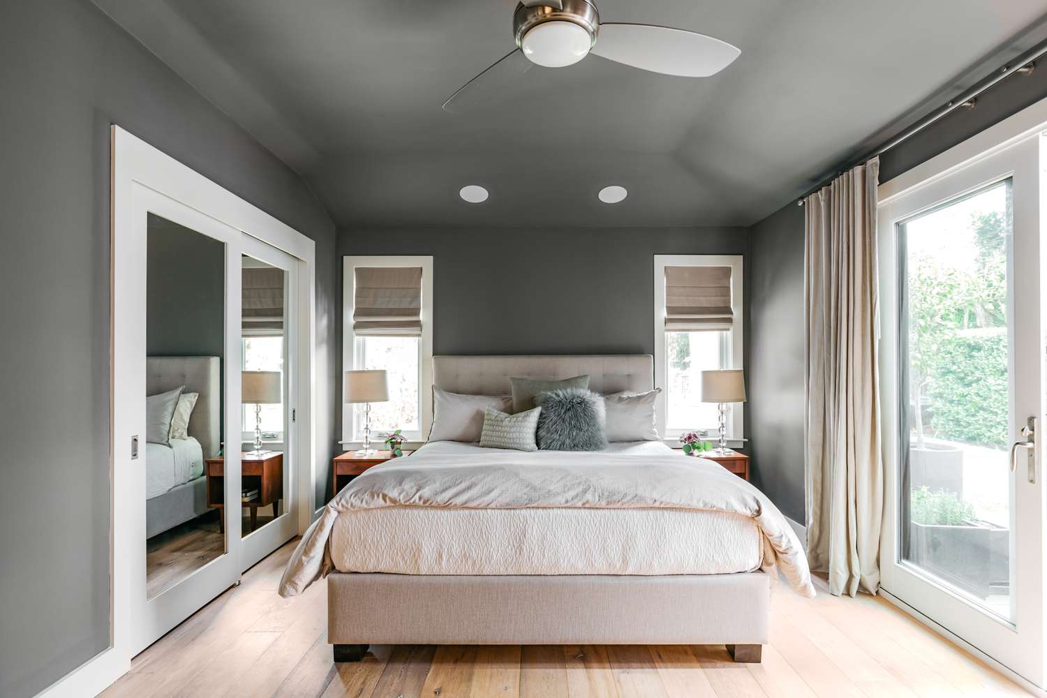
5. Paint Ceilings and Trim the Same Color
A clever trick for creating a seamless, taller room is to paint the walls, ceilings, and trim the same or very similar color. This eliminates sharp transitions and visually “blends” the edges of the room.
Bonus: this approach also hides architectural imperfections or awkward corners in tight spaces.
6. Use High-Gloss or Satin Finishes
Paint finish matters just as much as color. Glossy or satin finishes reflect more light than matte finishes, adding brightness and depth to the room.
Where to use them:
- Kitchen or bathroom walls (satin or semi-gloss)
- Trim and moldings (gloss or semi-gloss)
- Small furniture pieces like side tables or cabinets
But be careful — too much gloss can feel artificial. Use it strategically.
7. Keep Flooring Light or Consistent
Don’t forget about the floor! Light-colored flooring can contribute to an open atmosphere:
- Light oak or ash wood
- Pale laminate or vinyl
- Light-toned rugs (beige, cream, pale gray)
If possible, keep flooring consistent throughout small apartments or open-concept spaces to enhance visual continuity and make rooms feel unified.
8. Add Pops of Color with Accessories
While the base color palette should remain light and cohesive, you can add depth and personality with a few pops of color in accessories:
- Throw pillows
- Art pieces
- Blankets
- Planters or vases
Choose accents in complementary tones (such as navy, mustard, or emerald) to add interest without overwhelming the space.
9. Use Mirrors and Reflective Surfaces to Multiply Color
Strategic placement of mirrors helps bounce color and light throughout the room. Pair mirrors with light-colored walls and decor to multiply the spacious effect.
Other reflective surfaces to consider:
- Glass tabletops
- Metallic finishes on decor
- Chrome or brass light fixtures
They visually “expand” the area without cluttering it.
10. Avoid Strong Color Contrasts
Strong contrasts — such as white walls with very dark furniture — can visually “cut up” the space, making it feel segmented and smaller.
Instead:
- Choose furniture in similar tones to the walls
- Use gradual shifts in shade
- Blend textiles and accessories into the room’s overall color story
A harmonious look helps keep the room visually fluid.
Final Thoughts: Create Space Through Color
With the right palette, even the smallest rooms can feel bright, airy, and welcoming. By choosing light, cool, and cohesive colors — and applying them strategically — you can make your space feel larger without spending a fortune or renovating.