Neutral colors are timeless in interior decoration. They bring elegance, balance, and a sense of calm to any space. However, when used without intention or variety, they can result in dull and lifeless environments. The key to using neutral tones effectively is to introduce contrast, texture, and strategic accents—keeping the space visually interesting while preserving its serenity.
1. What Are Neutral Colors?
Neutral colors include shades like white, beige, gray, taupe, cream, ivory, black, and greige. These colors don’t appear on the color wheel because they are considered “non-colors” or desaturated tones. They form the base of many design styles due to their adaptability and timelessness.
2. Why Neutrals Are So Popular in Home Design
2.1 Versatility
Neutral tones blend easily with other colors and materials, making them ideal for layering and mixing. They suit all kinds of design styles—from minimalistic to classic, rustic, or modern.
2.2 Timeless Appeal
Unlike bold color trends that come and go, neutral shades remain stylish for years. This makes them a smart choice for long-term decoration.
2.3 Sense of Calm
Neutrals tend to evoke tranquility, clarity, and softness. They help create environments that feel peaceful and balanced, ideal for relaxation and mental clarity.
3. Common Challenges When Using Neutrals
3.1 Lack of Depth
When everything in a room is the same shade of beige or gray, the space can feel flat or uninspired.
3.2 Overuse of Similar Tones
Using too many similar tones can make the room blend into itself, without any clear definition or focal point.
3.3 Monotony
Without variation in texture, contrast, or shape, a neutral palette can become visually boring, even if it’s technically well-designed.
4. How to Make Neutral Colors Interesting
4.1 Add Texture
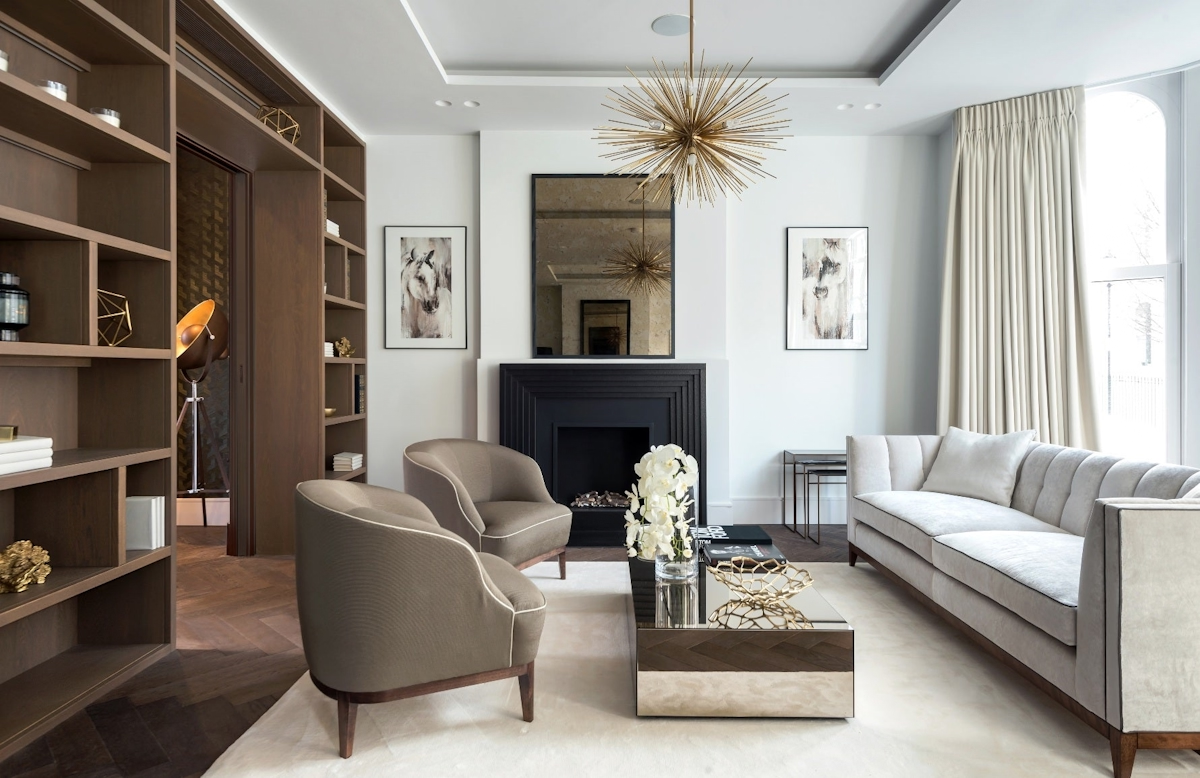
One of the most effective ways to add depth to a neutral space is through texture. Mix materials like linen, wood, leather, stone, metal, or wool. A matte wall beside a glossy tile, or a rough jute rug next to a velvet chair, creates dimension and contrast.
4.2 Play with Shades and Tones
Not all neutrals are the same. Combine warm and cool tones within the same palette. For example, pair warm beige with cool gray, or soft cream with charcoal. Layering tones creates complexity and prevents uniformity.
4.3 Introduce Accent Pieces
Add pops of color through decor accessories such as cushions, vases, artwork, or books. Even in a mostly neutral room, a single mustard yellow throw or a navy blue painting can add vibrant contrast without overwhelming the calm atmosphere.
4.4 Use Statement Furniture
A unique piece—a sculptural chair, a bold light fixture, or a textured coffee table—can become a visual anchor in a neutral space. This prevents the design from feeling flat or repetitive.
4.5 Highlight Architecture and Lines
In a neutral room, architectural features like moldings, beams, niches, or large windows stand out more. Use these structural elements as part of your visual interest, playing with light and shadow to emphasize depth.
5. Best Rooms to Use Neutral Palettes
5.1 Living Room
Neutrals work beautifully in living areas where comfort and calm are key. Combine different fabrics—such as cotton, suede, and linen—on sofas and pillows. Add a wood coffee table and metallic lamp to break uniformity.
5.2 Bedroom
Neutral colors create a cozy, restful retreat. Layer light grays, whites, and creams on bedding, walls, and curtains. A darker headboard or textured rug can bring necessary balance.
5.3 Kitchen
White or gray kitchens are popular for a reason—they look clean and elegant. Use contrasting materials like marble countertops, wood stools, and metal fixtures to bring dimension and warmth.
5.4 Bathroom
Neutrals in the bathroom create a spa-like atmosphere. Think beige tiles with brushed brass fixtures or white walls with natural wood accents. Candles, plants, and baskets can complete the look with texture and warmth.
6. Combining Neutrals with Other Colors
Don’t be afraid to break the palette with touches of stronger hues. Earth tones like terracotta, olive green, or rust pair beautifully with beige and cream. Navy blue or forest green adds richness to gray and white spaces. Using these as secondary colors keeps the environment interesting while preserving a neutral foundation.
7. The Role of Lighting in Neutral Spaces
Lighting plays a vital role in how neutral colors appear. Warm lighting brings out the creaminess of beige and taupe, while cooler lighting enhances the crispness of whites and grays. Use a mix of lighting types—ambient, task, and accent lighting—to make your space dynamic and flexible.
8. Minimalism Doesn’t Mean Boring
Many associate neutral colors with minimalism. But minimalism doesn’t have to mean empty or plain. By using strong design principles—like symmetry, repetition, and balance—you can create a minimal space that’s rich in detail and visual appeal.
9. Neutral Done Right: Style Meets Substance
Neutral colors offer endless possibilities when used intentionally. By incorporating texture, variation, accents, and good lighting, you can avoid monotony and create spaces that are calm yet captivating. Whether you’re designing a modern apartment or a traditional home, a well-planned neutral palette brings timeless elegance with everyday comfort.